One of the first problems encountered when building a mobile web app from scratch is the amount of space consumed by the browser’s address bar. This tutorial will demonstrate how to reclaim the screen real estate otherwise lost to the address bar while accounting for orientation changes, content height problems, and internal document links.
Defining the Problem
One of the most difficult aspects of designing for mobile devices is the limited amount of screen space available. Mobile web applications must be streamlined and intuitive in order to compete with native applications, and the presence of the browser’s user interface often only subtracts from the user experience and the site aesthetic as a whole.
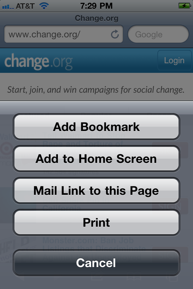
For example, consider the following mobile web site screen shot:

The above screenshot was taken on an iPhone 4 with both the Mobile Safari address bar and toolbar displayed.
Now take a look at the same screenshot without the browser UI:

The iPhone version of the site gained 60 pixels by removing the address bar at the top and 44 pixels by removing the button bar at the bottom for a total gain of 104 logical pixels of vertical screen space (the amount of space gained on Android devices varies, but the result is similar). When trying to build an immersive experience, it is easy to tell from the screenshots above what a large difference such a small change can make.
Unfortunately, the major mobile web browsers haven’t yet provided developers with an easy and universal method for simply toggling the browser UI on or off. However, there are two common approaches for getting the job done, and both will be addressed in this tutorial.
The Meta Tag Approach
If your web app is only targeting iOS, then the ideal solution is to set the following meta tag in the <head> portion of your HTML document:
  <meta name="apple-mobile-web-app-capable" content="yes" />
  <meta name="apple-touch-fullscreen" content="YES" />
  <link rel="apple-touch-icon" href="logo-touch-icon.png" />
  <link rel="icon" type="image/png" href="logo-touch-icon.png" />
  <meta name="apple-mobile-web-app-capable" content="yes" />
Doing so will completely remove both the browser address bar and toolbar from Mobile Safari, as shown in the second screenshot above.
In addition to the fact that this code will only reliably work on iOS devices, there is another major problem with this approach: it will only work after the user has added the web site to the home screen and when the user launches the site independently of Mobile Safari.
I’ve read unconfirmed reports that the meta tag approach will actually work on some Android devices also, but it certainly doesn’t work on my Nexus S and doesn’t seem to be officially supported by Android at all.
This is obviously less than ideal. Adding web sites to the iOS home screen is somewhat of an obscure iOS feature that many users don’t even know is possible and are unlikely to use while casually browsing the web.
Perhaps one day browser vendors will unite and supply a single cross-platform meta tag for fine-grained control over the browser UI without obstructing the normal web browser application flow (what life would be like if this actually occurred). Until then, we’ll have to take things into our hands the good old fashioned way: by using JavaScript.
Counterpoint: Allowing developers to control the presence of the address bar and/or tab bar grants creative freedom to developers at the expense of end-user freedom and the overall browsing experience. Without a consistent UX pattern for navigating back or entering a new URL, users will become confused while browsing and in some cases incapable of leaving the site without completely resetting the browser.
Counter-counterpoint: Creating a new UX pattern that empowers developers to determine the presence or absence of browser controls while simultaneously maintaining end-user control over navigation (perhaps by a combination of a fade-in-out effect and the ‘double-tap’ gesture or perhaps by forcing full screen apps to launch in a new window) could strike a balance between both interests.
The JavaScript Approach
Many of the cross-platform web app frameworks now available have come to rely on what is essentially a JavaScript hack to come as close as possible to providing a full-screen experience. The following frameworks all include some variation of the JavaScript solution I’ll demonstrate in this tutorial:
For those of you who just want the code without the narrative:
function hideAddressBar()
{
  if(!window.location.hash)
  {
      if(document.height < window.outerHeight)
      {
          document.body.style.height = (window.outerHeight + 50) + 'px';
      }

      setTimeout( function(){ window.scrollTo(0, 1); }, 50 );
  }
}

window.addEventListener("load", function(){ if(!window.pageYOffset){ hideAddressBar(); } } );
window.addEventListener("orientationchange", hideAddressBar );
I’m hosting the above code on GitHub:Gist, so feel free to fork, modify, or suggest changes. Just keep in mind that this is at best a browser-dependent hack. It may change in the future. It may not cover every edge case. It is untested on Blackberry and Windows Phone 7.
UPDATE 9/3/2011:
Thanks to the feedback from John Boxall below, I’ve added one more conditional in the “load” event listener. The hideAddressBar() function will now only be called if the user hasn’t started to scroll prior to the “load” event being triggered.
For those of you who want to learn exactly how and why this neat little trick works, read on!
Venturing Down the Rabbit Hole
In essence, the trick amounts to what can be condensed into a single line of JavaScript:
window.scrollTo(0, 1);The scrollTo call is a method of the window browser object with the following signature:
scrollTo(x, y);The first argument controls the distance to scroll the window on the x-axis and the second argument controls the distance to scroll the window on the y-axis.
The general concept is that while we can’t technically remove the browser controls from the web browser, we can scroll the viewport content down in order to remove the address bar from the window.
So, why only move the Y-axis 1 pixel? Shouldn’t it be 60 pixels for the iPhone? That was my initial thought as well. However, the address bar isn’t technically part of the document viewport. Rather than actually scrolling the content down 60 pixels, we’re actually taking advantage of a WebKit peculiarity (bug?) that will automatically remove the address bar when the scrollTo method is called. In my testing I was able to achieve the desired effect on iOS by setting the Y value to any integer, including -10, 0, 1, or 60. However, on Android, only positive integers achieved the desired effect, hence making “1? the best Y offset to use for the browser hack.
The next step is to determine when to call the scrollTo method. Ideally this should happen just after the page loads. All of the following implementations worked in my testing and are listed in order of elegance:
Adding an event listener:
window.addEventListener("load", function() { window.scrollTo(0, 1); });Adding an inline event listener:
<body onload="window.scrollTo(0, 1);">Within an embedded script tag (for those feeling rebellious):
    <script>
        window.scrollTo(0, 1);
    </script>
</body>
</html>
If you try all three of these samples on Android, things should work swimmingly (even though the third example is especially ugly). However, if you attempt the above on iOS, nothing will happen.
For reasons that aren’t entirely clear to me, Mobile Safari on iOS is incapable of applying the scroll hack with either of the above event listeners alone.
In order for this to work on iOS, you need to manufacture a slight delay between when the event listener fires and when the
scrollTomethod executes.
This can be easily done with the setTimeout method as demonstrated:
window.addEventListener("load", function()
{
    setTimeout( function(){ window.scrollTo(0, 1); }, 100 );
}
The method signature for the setTimeout function is:
SetTimeout(code, milliseconds, [ lang ])So in my example I provided an anonymous function containing the scrollTo call to be executed after a 100 millisecond delay. Oddly enough, the above still worked for me regardless of the integer provided for the millisecond delay. It worked with -100, 0, and 1 just as well as 100. Consequently, my recommendation is to use 0 for the milliseconds argument.
At this point, our address bar hiding JavaScript snippet should look something like one of the following examples:
Event listener:
<head>
    <title>Fullscreen Test</title>
    <script>
      window.addEventListener("load", setTimeout( function(){ window.scrollTo(0, 1) }, 0));
    </script>
Inline event listener:
<body onload=" setTimeout( function(){ window.scrollTo(0, 1) }, 0); ">Great! So now we can move on to actually building something useful, right? Unfortunately not. There are still several browser-specific issues that can foul up this hack.
Insufficient Content Height
What if your content isn’t large enough to fill up the entire screen? In that case, you won’t have a vertical scrollbar, and the trick demonstrated above will not work. In addition to simply adding more content to your page, there are at least three other less restrictive methods you can take to deal with this problem.
Option 1: Set the Initial-Scale
The first approach is to modify the initial-scale of your web page until your content fills the entire viewport. You can do this with the following meta tag:
<meta name="viewport" content="width=device-width, initial-scale=1.0">You’ll need to play around with the initial-scale value until you find the scale/zoom amount that matches your specific needs.
Option 2: Set a Minimum Height
The second approach is to use a simple CSS attribute. You can apply a sufficiently large min-height value to either the body tag or any other block level element on your page to account for the empty white space. However, you have to be careful here for two reasons: the exact pixel value needed by the min-height attribute will vary depending on the initial-scale (i.e. zoom) of the page and the value will change if the user rotates from portrait to landscape mode or vice versa. The basic syntax for setting the min-height attribute on the body tag is shown below:
body { min-height: 900px; }Again: the actual pixel value used is dependent on the initial-scale/zoom of your site. You may have to go quite high or quite low.
Option 3: Dynamically Set the Height with JavaScript
The third approach is to dynamically check the document.height property against the window.outerHeight property and then dynamically increase the size of document.height when necessary.
To following JavaScript code snippet is a non-framework solution to this problem:
   <script>
      window.addEventListener("load", function(){
          if(document.height <= window.outerHeight)
          {
              document.body.style.height = (window.outerHeight + 50) + 'px';
              setTimeout( function(){ window.scrollTo(0, 1); }, 50 );
          }
          else
          {
              setTimeout( function(){ window.scrollTo(0, 1); }, 0 );
          }
      }
      );
    </script>
On lines 5 above, I’ve added a seemingly arbitrary amount of padding (+50). This was necessary for the effect to work on both iOS and Android. I’ve also had to reposition the call to setTimeout as iOS wouldn’t produce the auto-scroll immediately after setting document.body.style.height. What I found to be especially odd was that not only did I need to reposition the setTimeout call, but for iOS I also had to add a seemingly arbitrary delay of +50 if I had just changed the document height. This was not the case initially (when using the load listener without setting a new value for the document height).
Internal/Anchor Links
Variations on the above browser hack are already widely implemented on the web. However, there is at least one use-case where forcing the browser to scroll to 0,1 is exactly the wrong approach: visitors coming to your site via an anchor (a.k.a. internal) link. To accommodate this edge case you need to only call scrollTo(0, 1) if the hash tag isn’t present in the URL. To implement this approach all we must do is check for the presence of a value in window.location.hash and then wrap our load event listener within that conditional. Doing so leaves us with something like the following:
    if( !window.location.hash )
      {
          window.addEventListener("load", function(){
              if(document.height <= window.outerHeight + 10)
              {
                  document.body.style.height = (window.outerHeight + 50) +'px';
                  setTimeout( function(){ window.scrollTo(0, 1); }, 50 );
              }
              else
              {
                  setTimeout( function(){ window.scrollTo(0, 1); }, 0 );
              }
          }
          );
      }
Device Orientation Changes
Another problem you may encounter deals with device orientation changes. On iOS, when a user rotates the phone from portrait mode to landscape mode, the scroll offset will not be changed automatically (Android doesn’t seem to suffer from this problem). This means that your user will be left somewhere further down the page than intended.
The fix for this is to set an event listener on window.onorientationchange to be notified when the orientation changes, and then to execute the window.scrollTo(0, 1) call again after the change occurs.
This seems like a good time to begin refactoring the code by splitting the code responsible for actually hiding the address bar into an independent function. After doing so, we’re left with the following:
     function hideAddressBar()
      {
          if(!window.location.hash)
          {
              if(document.height <= window.outerHeight + 10)
              {
                  document.body.style.height = (window.outerHeight + 50) +'px';
                  setTimeout( function(){ window.scrollTo(0, 1); }, 50 );
              }
              else
              {
                  setTimeout( function(){ window.scrollTo(0, 1); }, 0 );
              }
          }
      }

      window.addEventListener("load", hideAddressBar );
      window.addEventListener("orientationchange", hideAddressBar );
The above solution seems to work great for me on both Android and iOS, but there is one more issue that may or may not be relevant to your project: what if the user has scrolled significantly down the page prior to changing the device orientation? In that case, resetting the display to 0, 1 would cause the user to lose their place in the document. Accounting for this is highly implementation specific, but the gist is to simply set a y-axis threshold and then only reset the scroll offset to 0, 1 if the user hasn’t already scrolled beyond that threshold.
Locking the Address Bar Offscreen
Some frameworks, such as SenchaTouch, will actually lock the address bar off screen by preventing the user from scrolling beyond a given y-axis threshold. This is certainly possible, but I won’t discuss how to do so here as I find this solution to be a significant usability problem, particularly on Android. However, if you’re determined to achieve this effect, you’ll likely need to experiment with the window.pageYOffset attribute.
What About the Button Bar on iOS?
To my knowledge, there isn’t currently a solution for removing the toolbar/button bar on iOS from the bottom of Mobile Safari with JavaScript alone. The only way I’m aware of to achieve this effect is the meta tag approach explained at the beginning of this tutorial. Correct me if I’m wrong!
Making it Conditional
One consideration with the above approach not yet discussed is how to handle users visiting from a non-mobile or unsupported web browser. There are a number of different methods for determining which browser is currently accessing your site. If you’re working with a server-side scripting language, you may want to determine if the user is on a mobile device at the time the page is generated and only provide this hack when necessary. Perhaps a more robust approach would be to do the testing dynamically with JavaScript. Applying this consideration is beyond the scope of this tutorial, but please do leave your suggestions in the comments.
Caveat Emptor!
Browser hacks like the one I’ve described to hide the address bar defy best practices. The implementation I’ve explained in this tutorial has been tested on an Android Nexus S, iPhone 3GS, and an iPhone 4, but it is quite possible that I’ve missed an edge case somewhere. I’m also not at all certain that the implementation displayed will continue to work as-is into the future, which is why I was quite surprised to find so many of the primary web frameworks (e.g. iUI, jQuery Mobile, SenchaTouch) and prominent web sites (e.g. Gmail, Yahoo, Apple) relying on some custom variation of this hack. The reason, I think, is simple: a better, non-javascript solution doesn’t currently exist.
Wrap Up
I had three main intentions in writing such an in-depth tutorial on what may seem like a trivial issue.
First, I wanted to provide a pure JavaScript snippet for achieving this effect that is more robust than most of the others I’ve encountered. I hope that I’ve achieved that by accommodating for orientation changes, anchor links, and content-height problems.
Second, I wanted to dispel some of the magic behind how frameworks like SenchaTouch or iUI have made this effect possible. When I initially decided to use SenchaTouch for a freelance project some time ago, the “magic” of the framework for making apps fill the screen was one of the primary UX effects that appealed to me. It’s important to realize that this same effect can be easily implemented in pure JS regardless of whether or not you choose to use a JavaScript framework in your project.
Finally, the main reason I wanted to address this issue in such great detail is to raise awareness for just how fickle this approach truly is. Despite the fact that variations of this trick have become widely adopted, I believe it to be at best an inelegant kludge and at worst an unreliable browser-dependent hack that may or may not continue to work in the future. I would like to urge those in the browser business and the web / mobile development community as a whole to push for a more standards-based, JavaScript independent approach for dealing with this UX consideration. I think the meta-tag method Apple has implemented is a great step in the right direction, but, as mentioned above, it falls short of sufficiently addressing the needs of the development community.
The real question is: what do you think? Let’s talk about it in the comments section below.
Improve This Code
I have no doubt that some of our readers may be able to improve the code I’ve provided in this tutorial. If you see something in this post that could be optimized or improved, please leave your feedback below! You can also reach me via Twitter (@markhammonds), though it sometimes takes me awhile to respond to Tweets or DMs. The best way to reach me is either in the comments below or with the contact form on Mobileuts+. If I accept one of your suggestions for improvement, I’ll update this post and cite your name or handle!
{codecitation class=”brush: xml; gutter: false;” width=”0px” } {/codecitation} {codecitation class=”brush: c-sharp; gutter: false;” width=”0px” } {/codecitation}