I am starting a “WP7 ContextMenu in depth” series of articles in which I am going to talk about the Windows Phone 7 ContextMenu in details. In this article “Part1: key concepts and API” I will talk about the key properties, events and the main features of the Windows Phone 7 Context Menu control in details.
One of the new components in the Silverlight Toolkit is ContextMenu. Basically when the user taps and holds on any item the context menu appears. It is used in areas like for example the application list, where if you tap and hold an application you get the option to pin it to the start menu, uninstall, etc.
To begin using ContextMenu first add a reference to the Microsoft.Phone.Controls.Toolkit.dll assembly which is installed with the toolkit and you can find it in :
C:\Program Files (x86)\Microsoft SDKs\Windows Phone\v7.0\Toolkit\Nov10\Bin\Microsoft.Phone.Controls.Toolkit.dll.
You will also need to add the “toolkit” prefix declaration. Make sure that your page declaration includes the “toolkit” namespace:
xmlns:toolkit="clr-namespace:Microsoft.Phone.Controls;assembly=Microsoft.Phone.Controls.Toolkit"
![38menu2_2[1]](http://www.smartdomotik.com/wp-content/uploads/2011/08/38menu2_21.png)
The sample code should looks like:
|
<toolkit:ContextMenuService.ContextMenu>
<toolkit:ContextMenu>
<toolkit:MenuItem Header="Item1"/>
<toolkit:MenuItem Header="Item2"/>
<toolkit:MenuItem Header="Item3"/>
<toolkit:MenuItem Header="Item4"/>
<toolkit:MenuItem Header="Item5"/>
</toolkit:ContextMenu>
</toolkit:ContextMenuService.ContextMenu>
|
ContextMenuService
ContextMenuService provides the system implementation for displaying a ContextMenu. Basically it consists of a “ContextMenu” attached dependency property.
Identifies the ContextMenu attached property.
Example:
<toolkit:ContextMenuService.ContextMenu>
 <toolkit:ContextMenu>
 ...
 <toolkit:ContextMenu>
 <toolkit:ContextMenuService.ContextMenu>
ContextMenu
Key Properties
IsOpen is a dependency property of type bool. It gets or sets a value indicating whether the ContextMenu is visible.
IsZoomEnabled is a dependency property of type bool. It gets or sets a value indicating whether the background will zoom out when the ContextMenu is open.
Example:
<toolkit:ContextMenu VerticalOffset="100.0" IsZoomEnabled="True" x:Name="menu">
</toolkit:ContextMenu >
ItemContainerStyle is a dependency property of type Style .It gets or sets the Style that is applied to the container element generated for each item.
Example:
                   <toolkit:ContextMenu   x:Name="databoundMenu">
                        <toolkit:ContextMenu.ItemContainerStyle>
                            <Style TargetType="toolkit:MenuItem">
                              <Setter Property="Background" Value="YellowGreen" />
                              <Setter Property="Margin" Value="5" />
                            </Style>
                        </toolkit:ContextMenu.ItemContainerStyle>
                    </toolkit:ContextMenu>
VerticalOffset is a dependency property of type double. It gets or sets the vertical distance between the target origin and the popup alignment point.
Example:
<toolkit:ContextMenu VerticalOffset="100.0" IsZoomEnabled="True" x:Name="menu">
</toolkit:ContextMenu >
Events
Closed occurs when a particular instance of a ContextMenu closes.
Example:
this.menu.Closed += new RoutedEventHandler(menu_Closed);
       void menu_Closed(object sender, RoutedEventArgs e)
        { //add some content here}
Opened occurs when a particular instance of a ContextMenu opens.
Example:
this.menu.Opened += new RoutedEventHandler(menu_Opened);
       void menu_Opened(object sender, RoutedEventArgs e)
        { //add some content here}
MenuItem
Key Properties
Command is a dependency property of type ICommand. It gets or sets the command associated with the menu item.
CommandParameter is a dependency property of type object. It gets or sets the parameter to pass to the Command property of a MenuItem.
Header is a dependency property of type object. It gets or sets the item that labels the control. The default value is null.
HeaderTemplate is a dependency property of type DataTemplate. It gets or sets a data template that is used to display the contents of the control’s header.
ItemContainerStyle is a dependency property of type Style .It gets or sets the Style that is applied to the container element generated for each item.
Events
Click occurs when a MenuItem is clicked.
Example:
<toolkit:MenuItem Header="Add" Click="MenuItem_Click"/>
       private void MenuItem_Click(object sender, RoutedEventArgs e)
        {//add some content here}
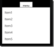
Populating ContextMenu with Items
Here is an example of how to use this control in the easiest way using MenuItems:
|
<Button Content="OpenContextMenu" Height="100" Width="270">
<toolkit:ContextMenuService.ContextMenu>
<toolkit:ContextMenu>
<toolkit:MenuItem Header="Add" Click="MenuItem_Click"/>
<toolkit:MenuItem Header="Update" Click="MenuItem_Click"/>
<toolkit:MenuItem Header="Delete" Click="MenuItem_Click"/>
</toolkit:ContextMenu>
</toolkit:ContextMenuService.ContextMenu>
</Button>
|
|
private void MenuItem_Click(object sender, RoutedEventArgs e)
{
MenuItem menuItem = (MenuItem)sender;
MessageBox.Show("You chose to " + menuItem.Header.ToString(),"Result",MessageBoxButton.OK);
}
|
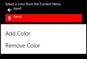
The result can be seen on the following screen shots:

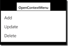
In this example when the user tap and hold the “OpenContextMenu” button as a result a context menu appears from where you can select from three options. After you choose an item a MessageBox appears with information about the selected operation.
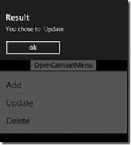
DataBinding ContextMenu
Here is an example of how to populate ContextMenu using simple data binding. We will also add some ItemContainerStyle in order to change the background color of the items:
| |
<Button Content="DataBinding" Height="100" Width="270">
<toolkit:ContextMenuService.ContextMenu>
<toolkit:ContextMenu x:Name="databoundMenu">
<toolkit:ContextMenu.ItemContainerStyle>
<Style TargetType="toolkit:MenuItem">
<Setter Property="Background" Value="YellowGreen" />
<Setter Property="Margin" Value="5" />
</Style>
</toolkit:ContextMenu.ItemContainerStyle>
</toolkit:ContextMenu>
</toolkit:ContextMenuService.ContextMenu>
</Button>
|
|
List<string> menuItems = new List<string>() {"Copy", "Paste", "Cut" };
this.databoundMenu.ItemsSource = menuItems;
|
The result can be seen on the following screen shots:

That was all about the key properties, events and the main features of the Windows Phone 7 ContextMenu in depth.
I hope that the article was helpful. You can find the full source code here:


![5810.image_5F00_4759BCBA[1]](http://www.smartdomotik.com/wp-content/uploads/2011/08/5810.image_5F00_4759BCBA1.png)